 |
 |
||||||||||||||||||||||||||||||||||||||||
Let's start with some bygone names:
Said the local paper when it was renovated: The building was designed to fit onto an oddly shaped lot, giving it a “flatiron” (triangular) shape. It was constructed in two stages, with the basement and first story constructed in 1926 and the second story completed in 1927. Doesn't look like it from this angle. One of the original tenants was the "Milwaukee Thirst Parlor."
My, that's a tall hotel:
I mean, it's like it was made for tall people. Or I was sloppy when I corrected the perspective. Finished in 1918, it was of course a Source of Pride, and went the usual route: bankruptcy, decreptitude, renewal, and now . . .
. . . all together now . . .
Senior housing.
Lots going on here, and none of it's good:
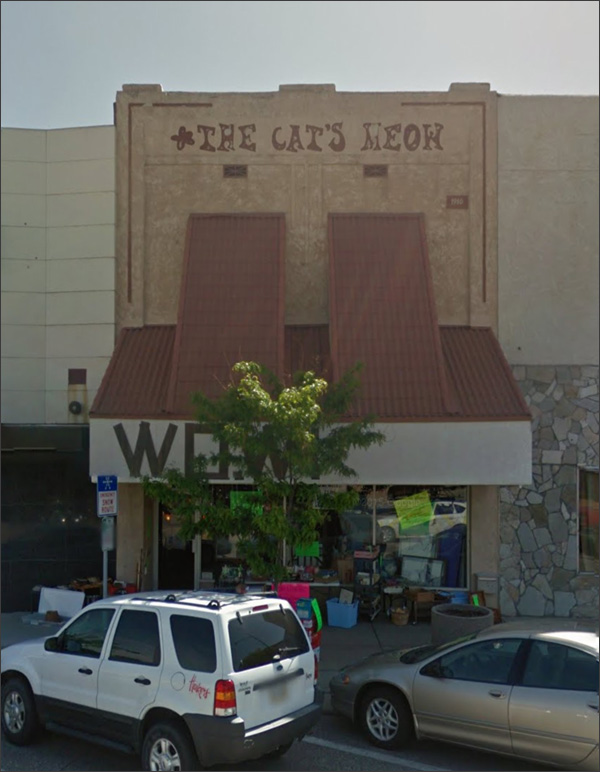
It looks as it's been a "boutique" for some time, starting with the Cat's Meow. Has a hippie vibe. Fargo had one of those types of places - an embassy for the counter-culture. Okay, Googling . . . Criminey, it has its own page.
Oh, man, this was just like Vanity in Fargo:
It's WOW now. Wonders of the World.
I can't tell if this was new construction or renovation, but I suspect the latter.
Let's go around the corner.
Scottbluff is modernizing! A city on the . . . grow.
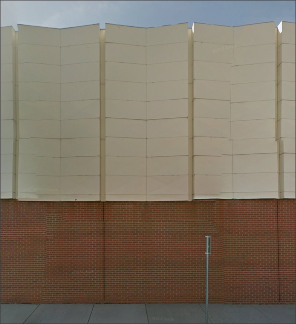
Oh, for heaven's sake.
They knew enough to save the top, but didn't know enough to know how stpid it would look. It's like the city was buried under lava, and you see the tunnel the first explorers dug through the rock.
The Eyebrow always gave a post-war downtown a jaunty appeal:
But it seems to be staring at nothing now, and there's no one behind the lid.
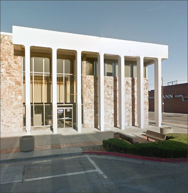
Technically, it's classical:
It grows on me, the more I look at it. It could have been less, which would have been worse - the commitment to the stone and the meaninless pillars somehow makes it work as a period piece.
Some buildings soar; others just squat on their haunches.
Look. I understand. You want to be up-to-date. But this is like . . . like wearing one high-heeled shoe and one sandal.
The lighting inside is interesting - what the devil was this redesigned to accomodate?
Well, looks like those are the only interesting HOLY CROW
Hello, 1946: things are looking rather optimistic. More on the history, with some interior shots. here.
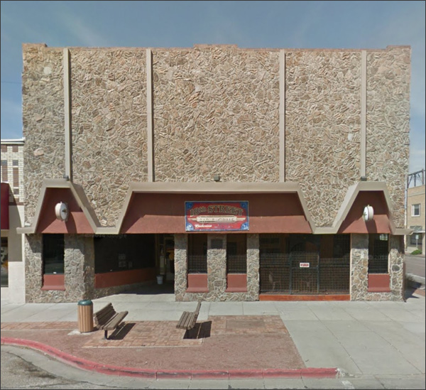
It's like a Music-Man style flim-flam artist came to down, but was selling stone facades instead of band instruments:
The empty storefront and unoccupied chairs just complete the generla mood, don't they.
Severe but handsome; pitty that the flutes in the columns seem unable to extend below the traffic light arm.
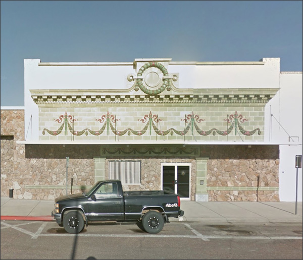
But of course that's an illusion. Ornate cornice in a style I've not seen very much - no overhang. There's something odd about the building, as though it was a 19th structure that got an early 20th century overhaul. Those things didn't happen. |
 |
||||||||||||||||||||||||||||||||||||||||

|
 The second largest city in the Panhandle! Fifteen thousand souls. Home of the West Nebraska Community College.


