 |
 |
||||||||||||||||||||||||||||||||||||||||
|
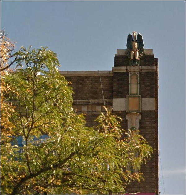
On the bottom left, you see a part that was removed, or fell off. Might have been cheaper to throw it than spend the money keeping it in constant repair. History is expensive.
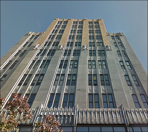
It would be the pride of the town in a smaller city; on the East Coast, there are many of this tribe. One question:
Why did the bricks change color? Was it built in two phases? It's the Hersch Tower, a little googling revealed. Went up after the Depression hit, because heck that couldn't last forever. Let's take a look at a postcard, found at the Digital Commonwealth:
The buildings on the lower left are still around, but tired and hiding their faces.
More regrettable facadomy:
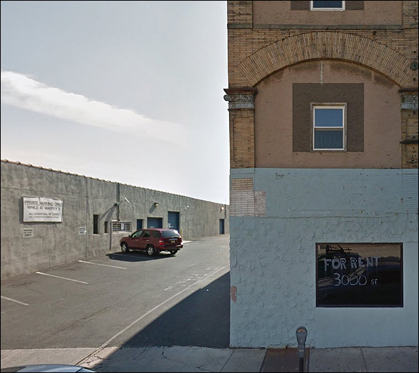
I think the middle-and-right portion are one building, but it's hard to tell what anyone was trying to do. A canvas for a big sign? No evidence.
"Loads of Natural Light" probably isn't on the sales brochure for the one on the right.
A reminder of the things you can do with brick - and how elegant and civilized any street could look, if you had a developer who wished to make it so.
The slanted word is your guarantee of savings!
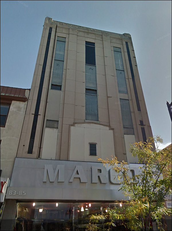
The Hersch may get the attention, but this one had real sleek poise. Once.
That big second floor window, reduced to that tiny vent - what architect would work on this without feeling like a vandal?
Life & Death & stuff:
He looks like he's sitting down, a winged gargoyle observing the world with contented amusement:
We'll never know who made him. Someone knew him; the name is written somewhere, but no one's put it together with a picture and put it up on the web. Or have they? Er, no. Sorry.
Finally: a courthouse, and some Latin.
They'd get half of that line up nowadays, then say "leave it at that, no need to borrow trouble." |
|||||||||||||||||||||||||||||||||||||||||

|
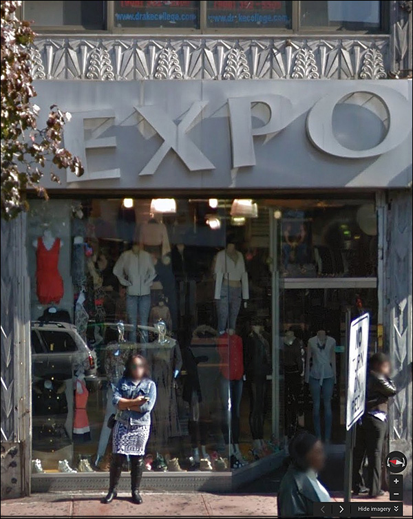
 We break from our grim procession of empty small downtowns - with the occasional bright spot full of commerce and history - and take a look at modern overlays over old beauty. The EXPO sign certainly gets your attention, but it's what it covers that makes your eye linger. Those decorations owe nothing to any period, really; they came to us all at once.
