 |
|
 |
|||||||||||||||||||||||||||||||||||||||||||||
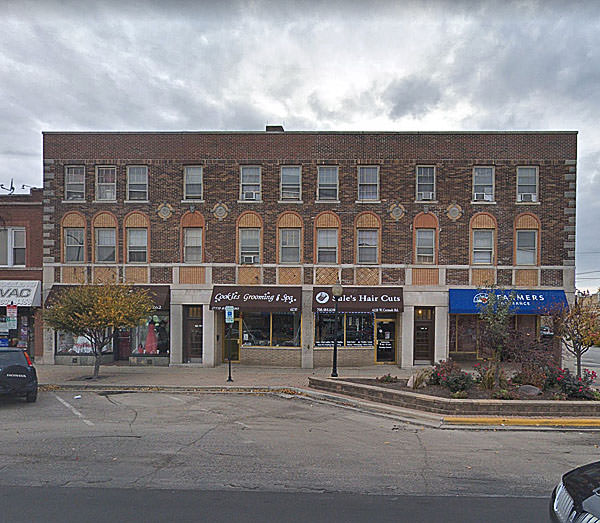
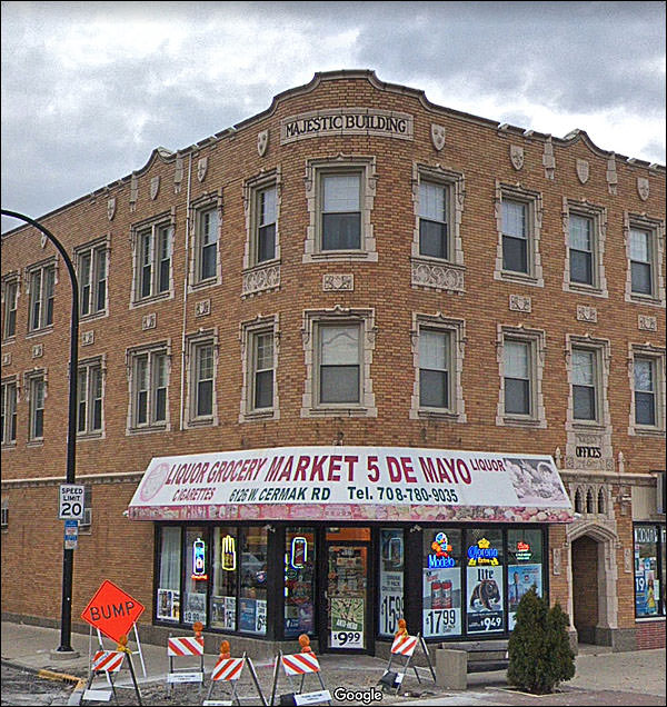
This is Cermak Avenue. There had to be a reason I snipped these. Was it the fact that the building’s lopsided design was not immediately obvious?
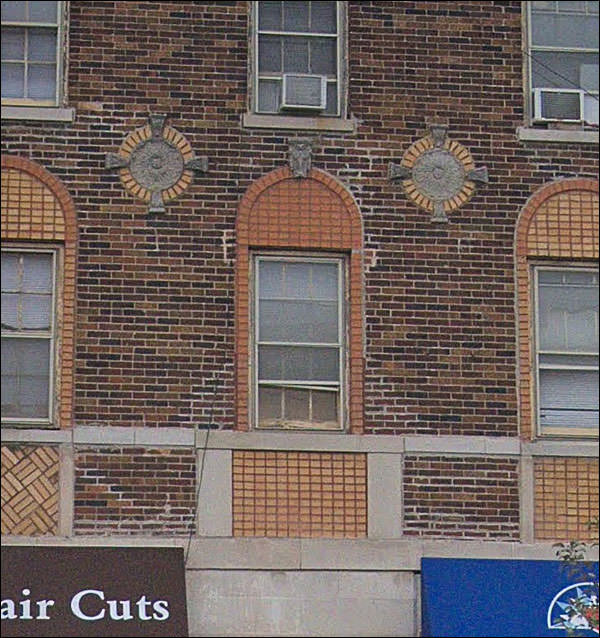
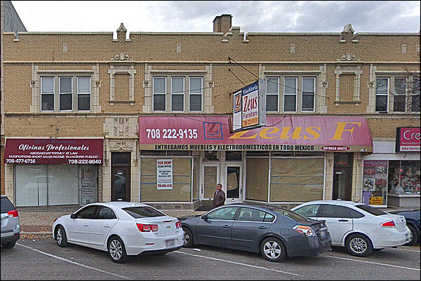
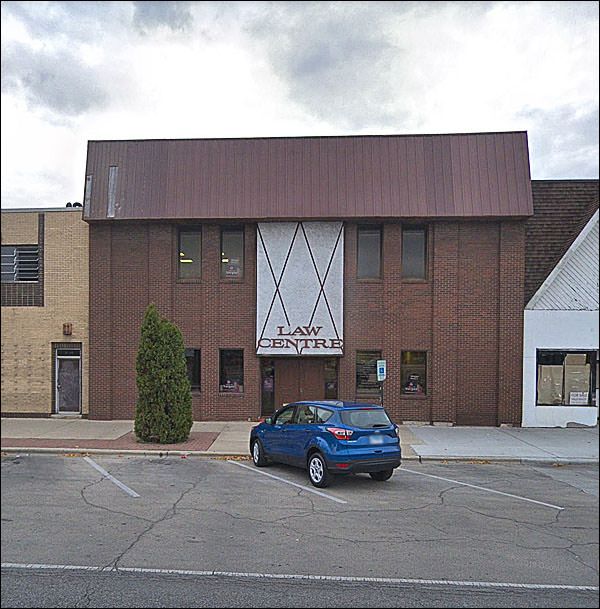
Was it the mismatched brick and off-the-shelf decorations?
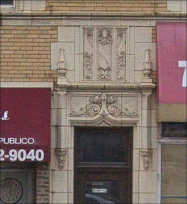
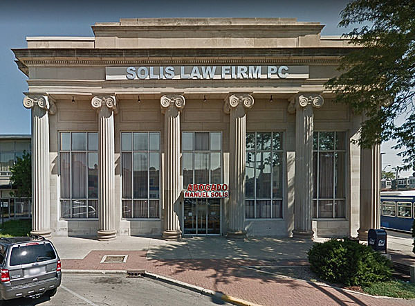
Was it the little vestiges of Capone era grace, the terra-cotta classical ornaments that graced countless buildings, and are mostly gone?
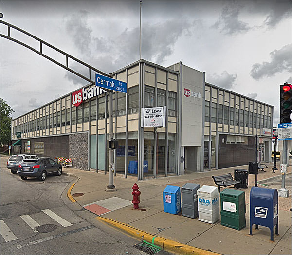
Was it the OUMB that nevertheless has a certain mid-century dignity and appeal?
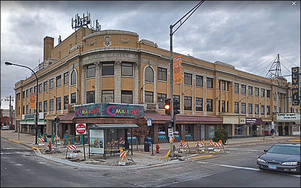
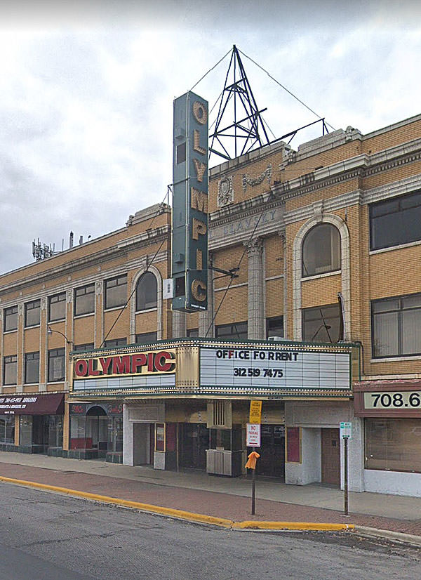
Could’ve been this typical 20s project: the movie-theater / office complex, an expression of civic pride and prosperity:
Who?
Czech all the way:
They lost it in the crash, but a Czech organization bought it back a few years later. Cinema Treasures notes that it closed for years, and had a run for a few years as a theater serving the Latin Community. The usual churn of a city.
Yes, it is.
They didn’t have to spend that much money on the windows, but it made a difference. The low-slung annex. All spec, I’m sure.
I love the 20s.
"We can attach it to the wall.”
“We can do that.” “You know, I’m still worried. Build something on the roof to hold it as well.” Sad bit of Buckaroo Revival there. But it’s always sad.
“Manuel Solas” looks like a misspelled promise of a massage parlor.
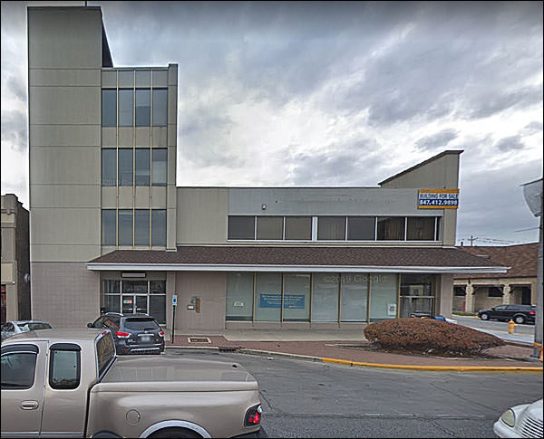
Obviously a bank, once.
What?
And no I don’t know why there’s a giant corn dog on the corner.
Tidy little mid-century citizen, and that sign? It has to be original.
You can, with a fair degree of certainty, predict the exact width of the architect’s lapels at the time of construction.
That’s it. Why did I start snipping? Because those big ones deserved a moment of adulation. Nothing out of the ordinary, but a reminder of how prosperity leaves a lasting mark.
|
|||||||||||||||||||||||||||||||||||||||||||||||
 |


 I’ve no idea why I went here, but I suspect I was looking for some locations favored by Al Capone.
