

 |
 |
|||||||||||||||||||||||||||||||||||||||||||||||||||||||||||||||||
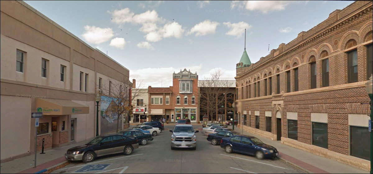
What’s always notable about these little buildings in old downtowns is the side-by-side proof of how different owners and circumstances change the look and personality of identical structures.
Did they have the same owner once, the man who built one, then said “That worked out well. Here are the plans, builder; make me another,” and did he have to sell one years later?
The twins hated each other, but their father knew they both liked to look out the window to see if there were any handsome young fellows coming in from the farms on Saturday, so he accommodated them as best as he could.
The low slung building is like a compendium of half-assery, post-post-modernism division.
HAUGEN
Apparent that the bricked off third-floor is original. Somehow it’s okay when they did it.
Unique OUMB: not entirely U, but an ungainly attempt at “Traditional.”
I’m thinking of renting the second floor to lizard people who like to slither, instead of stand erect.”
That it is.
More peculiar window decisions. I suppose the turret glass was hard to replace. But the other window looks like it’s wearing an eyepatch. Neither contributed to the building’s attractiveness, and makes you realize it was better when it had more glass.
Well, that’s a mess.
So: the long lines of brick indicate it was either a new building in the 30s - 50s, or a total facade makeover. But the second floor is late 50s / early 60s, and doesn’t quite match, and doesn’t go all the way to the edges. A bit unnerving.
You know what this is:
Still open, or rather open now after a possible stint as a flophouse and/or senior housing.
Given the case study of the Haugen, I’m wondering if these were ever unbricked.
I think so. And if that’s the case, DAMMIT, DON’T DO THAT.
Either there’s a day care at the end of the alley or a white rusty van with a sign that says CANDY
There are enough buildings like these; we can applaud the occasional modernization that sacrificed the history for a new modern look on the Main street.
The vestiges of the sign tell you a lot about Main Street and the fortunes of national retailers.
Great job filling in that arch, fellas; really adds some pizazz and personality to the streetscape.
Next door: bank, or wannabe. Never trust the bank in the middle of the block.
JOHN CURTIN
He was proud of the thing and everyone had better well know who built it and spent a little extra for that fancy top. You could charge $5 more a month with a cornice like that.
Ah, there it is, the OUMB in its purest late 70s / early 80s form.
Whoa! The Bank Block.
That thick column in the corner by the entrance was a staple of the times, and makes you wonder if they were making it difficulty for robbers to escape quickly.
Mod . . . modash?
The Google view lets us go back to its previous facade: Kitschy but fun, and more interesting.
Finally:
The Court house, the thing around which the main streets are organized, the civic center, the embodiment of the body politic, the connection to eras and civilizations past. It’s a wonder they didn’t knock them all down.
|
||||||||||||||||||||||||||||||||||||||||||||||||||||||||||||||||||
 |