

 |
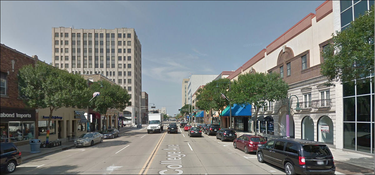
I think I snipped this because A) I was starting out on the edge of town, and .
. . . and because you know what that was, right? They never lose their original spirit.
The smoked-glass era of modernism had its hits and misses.
Problem is here, the number of floors suggested by the glass panels probably doesn’t relate to the actual number of floors.
Let’s make sure the second floor looks like something taken from an enormous bridge in another city!
“I like your building, John. Mind if I build one next to it and copy the cornice exactly? “Not at all, go ahead. Copy the windows if you like as well!” “I don’t like it that much.”
Ugly ground floor rehabs, but look at that Dutch second floor:
I’d say “Dutch Revival” but I don’t think there was an original Dutch craze to revive.
They . . . slathered it with stucco?
That never looks good. Always looks like an old lady with too much pancake makeup.
“Here you can see where they tunneled down through the volcanic deposits, working their way along the walls. Unfortunately they ruined much of the frescos.
Love that window. It’s ill-sized and a bit too clunky - LOOK AT ME I’M MODERN - but I like it.
All civic centers bear the stamp of their era.
This is not necessarily a good thing. I mean, you know what this is, and it gets that across. It’s institutional.
Something of a mystery:
Someone knew what this meant, once.
Thirties modernism, diminished by incremental alterations that did nothing to highlight the building’s spirit.
Well, that’s interesting: big swank entrance, and it looks as if it could be original. The stone hue would match the era.
Gee, wonder if I should look up with early 20th-century cliched farmboy amazement!
Gawrsh! Built in 1952 for the Lutheran Aid. Tallest building in town. Quite an investment.
A nice old building with a bad case of Elephant Man disease on its side.
Put some lotion on that, it might help.
Beeeeyoutiful little modern bank, much like its New York older brothers.
Never fails to amaze me that they gave up this style for its opposite, the bricked-up thin-window structures of the 70s. Oh, right - the whole energy thing. In the future there wouldn't be enough energy to air condition a space like this. Forgot about that/
Oh jeez
Now, if you’re thinking it’s an office building that got a SUPER 80S OVERHAUL . . . you’re right.
Origami can help redeem most institutional buildings from this era.
The plaza with the seating says “60s / 70s campus.” The building in the back, we’ll get to in a bit.
Revisiting the street view, I found this . . .
On a subsequent visit:
Back to the tall building we saw in the background:
The Irving Zeulke building. I commend this history. Rather unique decorations.
Finally: uh oh.
The downtown mall. The sort of thing that always ends up described as “troubled” or “struggling.” But according to the reviews - at the time I write this - it’s doing okay. That would be rare.
|
 |
|||||||||||||||||||||||||||||||||||||||||||||||||||||||||||||||||||||||||||||||||||
|
|||||||||||||||||||||||||||||||||||||||||||||||||||||||||||||||||||||||||||||||||||||
 |