Twenty-five thousand souls. Wikipedia: "In 1884, a short-lived town called Ashley was founded where Kalispell is today. Three years later nearby Demersville was founded. Demersville quickly grew to be the largest town in the area, but when the Great Northern Railroad bypassed the town it was abandoned just as quickly, with people moving the short distance to the new town of Kalispell."
I wonder if there's anything left. . . nope. Just a road with that name. Well, let's visit the winner, and still champeen.
Yes, a giant appeared with a massive scythe, and took off the tops of the building with one mighty swing. Locals still call that day “The Haircut.”

It pains me to say it, as I usually love this style of building, but this does shade into OUMB territory. The sign is partly to blame. But the building itself is off. It is lacking. The stone color for the entrance is wrong. The way the marble fits together is a bit unnerving.
Just my opinion, of course.

Buckaroo’d within an inch of its life, this one; it seems almost punitive and vengeful.
You have to love the balcony with the horse, because why not.
 |
|
|
 |
|
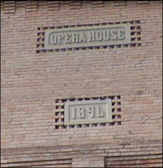
Ah: the old Opry House, where nary an opera was ever performed. |
 |
|
|

A li’l bit of the ol’ American Fascist architecture here, except of course it wasn’t really fascist. Even those guys had a trace of historical reference.
Not to say I don’t like it. I love it.

Every mountain town in the 60s and 70s had a freethinker who believed he had new important ideas about architecture.

Yes, that’s what it is.
The absence of small windows tells you that it had a shared-bathroom arrangement. Or so I suspect.

And here, class, we see failures on multiple levels. On all possible levels.
The sign is a mess, poorly spaced, inept. The stone is meant to evoke . . . what? Some ancient grotto? If so, they didn’t have circular windows like that.
The whole facade looks if you could pry it off with a crowbar.
On the building next door, a bit of off-the-shelf ornamentation that serves no function, but it’s one of those gifts to the street developers felt honor-bound to include. If it fit the budget.

Well, that’s an interesting tableau. I did not notice the thing climbing up the front of the facade when I snapped this. I was concentrating on the Hi-Power sign, still vivid after all these years, and the small chameleon building that has adopted the gas sign’s color.
Now I notice the absurd braziers on top, which have survived for over a century. What did they make those things out of?

Wow!
We usually get one Wow! per week, and this might be it. The pressed-tin facade - if that’s what it is, could be brick - looks like someone selected the brick pattern in MS Paint and used the bucket tool.
Nice details, lovingly accented. A bit fussy, but they liked that.

Meanwhile, over on Planet OUMB:

There’s “streamlined” and “stripped down” and then there’s just cheap.
Closed when the management opened a 14-screen theater on the edge of town. Now a church. I’d love to see the interior, but no shots seem available online.

Awwwww
That’s adorable. You may ask: why is this nice, but the Obligatory Ugly Modern Bank above not? Don’t they both have jutting things? Yes. But this has a lighter touch and a California-50s vibe in the front. The other is just Logan’s Run crap.

Oh dear
Your bank should not look like a Cubist version of a frame from “Mutual of Omaha” where the long insect attempts to devour the stout bug prey.

This is breathtaking. Sad, but amazing - what is this doing here?
Unicorn crests? A king’s crown?
It had to be a jewelry store.

Rather idiosyncratic take. Unique arches. Brick does most of the work here, but the stone accents add interest.
Ah, of course.

I know this ad. Can you say the slogan?
Good for you!

Another testament to Kalispell prosperity. Upon researching the city a bit more to see about the Strand, I landed on this site. It says that this was commissioned for Monkey Ward. No definite store style for that chain.
I also learned that the facade I said was pressed tin is, in fact, pressed tin. And I saw a few buildings I’d missed.
Like this one:
Hmm, don’t think that marquee is original.
Or good.

Finally: never mind the Wow, we have a Holy Jeezum Crow:
Original purpose?
City Garage.

|


